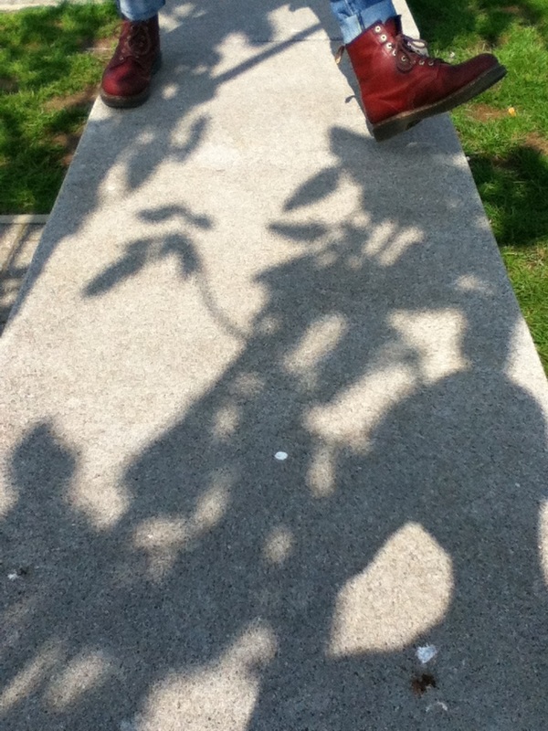
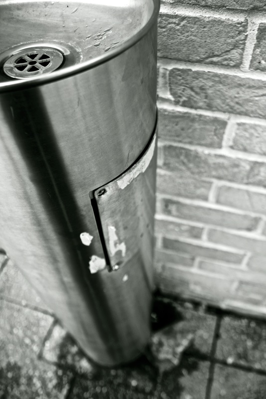
The Formal Elements
Light: Is the light natural or artificial? What parts of the photo are the brightest? Are the shadows more prominent? What direction is the light coming from?
Focus: What is the focal point of the photograph? What is clear? What is blurred?
Shape: Geometric or Organic shapes?
Tone: Is there a mixture of dark and bright tones?
Line: Are there lines in the photo? Do they make up the structure of the image? Do they outline objects? Are they edges?
Texture: Imagine you could touch the surfaces, how do the objects in the photograph feel?
Pattern: Are there objects in the image repeated to make a pattern?
Space: Is there depth to the photograph? Are there empty spaces? Or is every gap filled?
|
Francesca Woodman
I like this photo by Francesca Woodman because there is a clear sense of texture, tone and lines in this image. The sharp, jagged bits of broken up plaster lay on the floor and reflect the light streaming through the window. All the walls and fire place have paint peeling off providing a strong feel to the image, a feeling of a crunchy, crispy, dusty room. There is even flakes of wallpaper lying on the gritty floor boards, this emphasises the deterioration and neglection of the room. There is also a clear sense of tone in the image, the dark corners and cracks contrast against the bright natural light let into the room through the window-less frames. 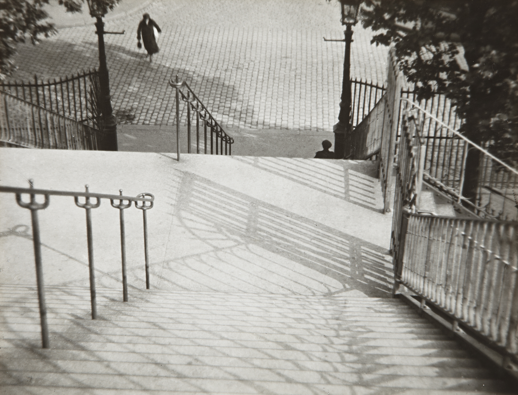
Montmartre, 1927
Harry Callaghan This B&W photo by Harry Callaghan has a heavy emphasis on pattern. The overlapped reflected windows provide a strong pattern throughout the image. The details of each window are very clear and the sharp, black window frames give a very industrial look to the photograph which leads the viewer to think it may be of a high rise factory or tower block possibly in a built up area. There is a clear sense of geometric symmetry with all the evenly spaced windows across the photo and the rectangles that make up the windows. This pattern is so clear that the image looks more like a print than a photo because the bold outlines of the windows and brickwork are repeated almost as if they have been painted. There is also a strong contrast between the bright, white windows and the dark, black walls. This mixture of tones is emphasised by the shadows that cover the brickwork only being highlighted by the light coming from the windows. The element of lines are everywhere in the image and make up the structure of the photo, this can even be categorised to just rectangles, these shapes fill the image; in the windows, the brickwork and in the shape of the building. 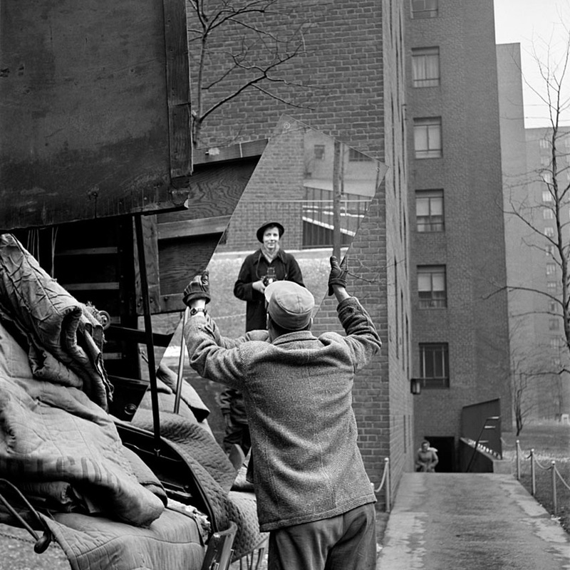
Self-Portrait, 1955
|
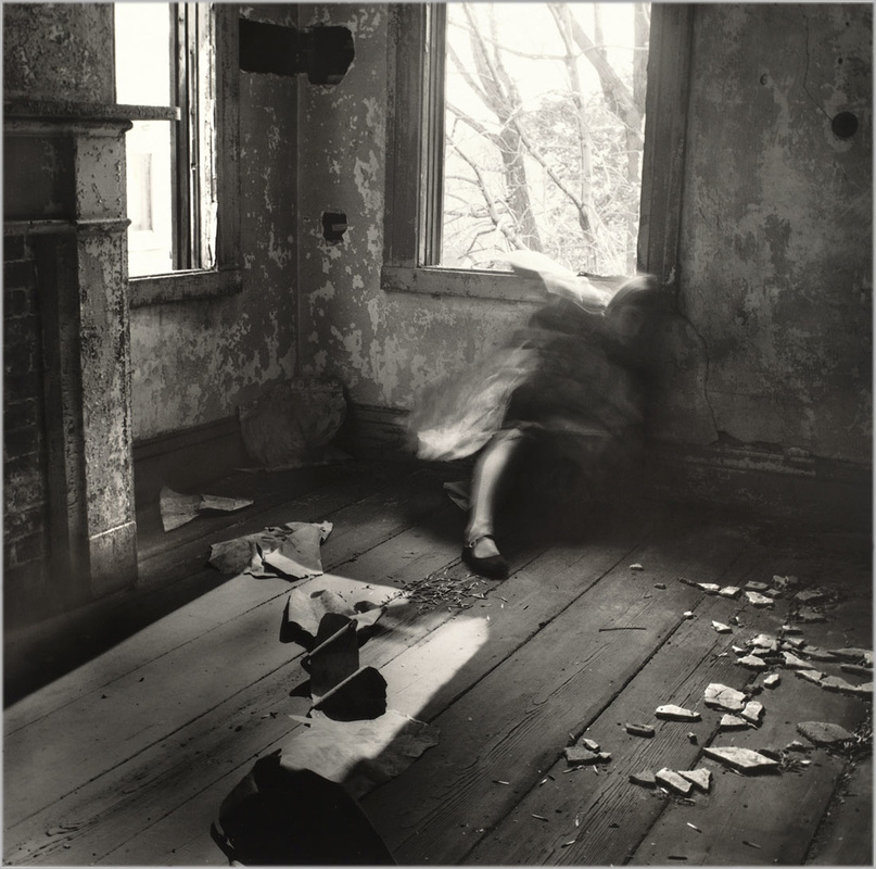
House #3, Providence, Rhode Island, 1976.
Andre Kertesz This B&W photo by Andre Kertesz is taken from a "looking down" point of view, the tone and line elements are very clear in this photograph. The image is filled with lines, lines of the steps, railings, bricks etc. The styling of the railings and cobbles suggest it is an old photo because nowadays few roads are cobbled and its not as common for modern railings to have spikes on top. Kertesz has slightly over-exposed this photo to create a greater difference in the contrast of the tones. The paving is very white while the shadows and painted lamp posts are very dark, this makes the photo more dynamic and overall more interesting. Over-exposing the image also softens down the tones making them more pleasurable to the eye and less over done. 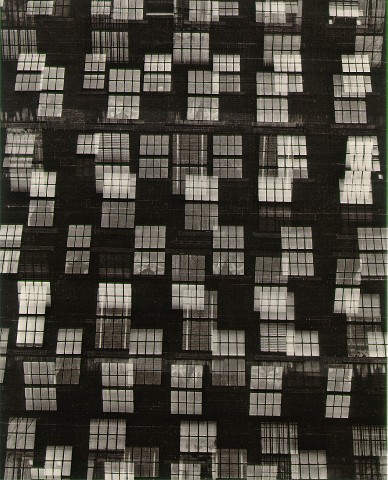
Chicago, C. 1948
Vivian Maier Vivian Maier has perfectly framed this image, she is directly positioned in the centre of the image and the mirror which shows how skilled she is and how well she knows her camera. It is also a good angle of view because the image has captured three sections; the tower block takes up the right hand side, the mirror and the man take up the middle section and the truck takes up the left side. This is called the rule of thirds when an image is divided into three sections both vertically and horizontally. The sharpness and clarity of the image is also superb. The man and truck are in perfect focus with Maier being just out of focus enough to not overcomplicate the image or distract from the man loading/unloading the truck. The B&W colour of the photo softens down the tones to also give it an overall cleaner look to what could be a "messy" image. |
Experiment #1
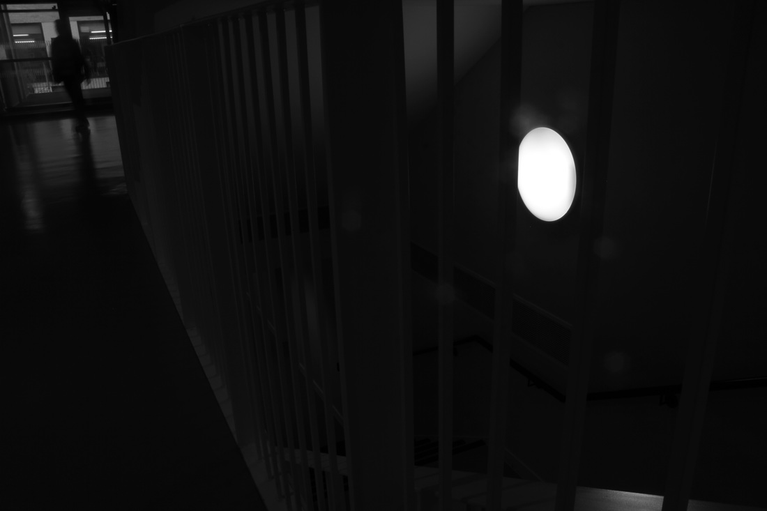
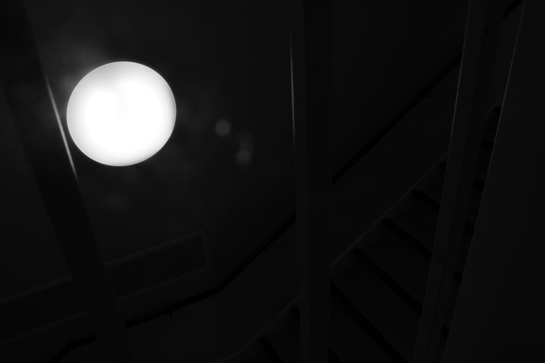
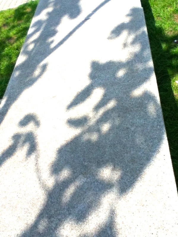
Above are a selection of photos inspired by my favourite of the artists; Harry Callaghan. I took interest in his focus on pattern and shadows and tried to replicate this in my photographs in my own style. My favourite photo was the first one in the series taken in the hallway of the photography block, I took this in B&W on a Canon DSLR, I decided to shoot it in B&W rather than editing it into B&W like I have done in the past because I feel you get a better sense of feel and know what your image is going to turn out like by shooting in B&W in the first place. I like this image because your focus is immediately drawn to the bold, bright, white shape in the right of the image. After looking at this you start to gather a sense to what the image is actually of and then the next thing you notice is the shadow of a person walking through the corridor on the left of the image. If you also look carefully you may be able to see the faint outlines of the white stair rails. The lack of the light provides a much less complicated image and instead gives a less detailed but more composed example of what the image is focused on, this is helped by the use of only B&W colours as this means you are not distracted by colour and just focus on the light and outlines.
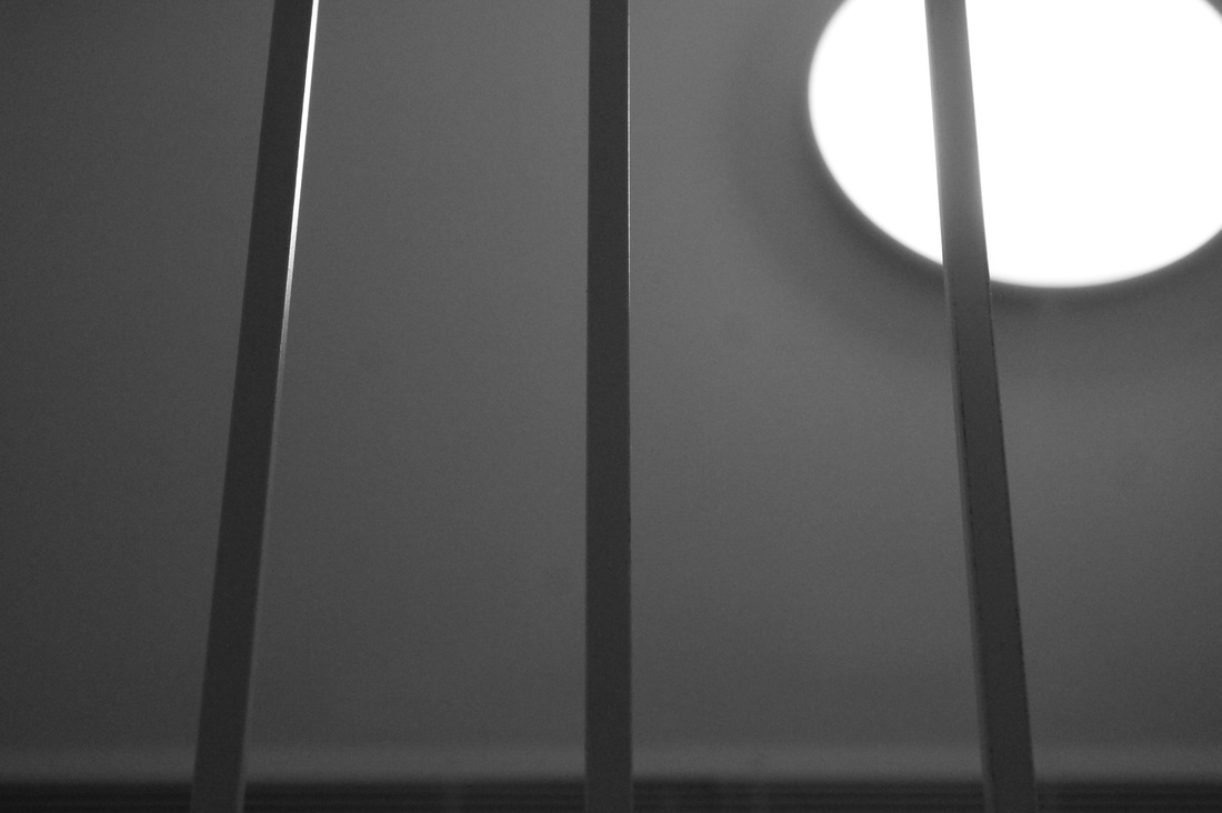
Experiment #2
Experiment #2
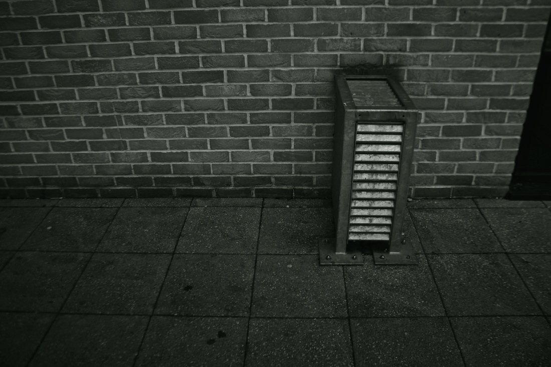
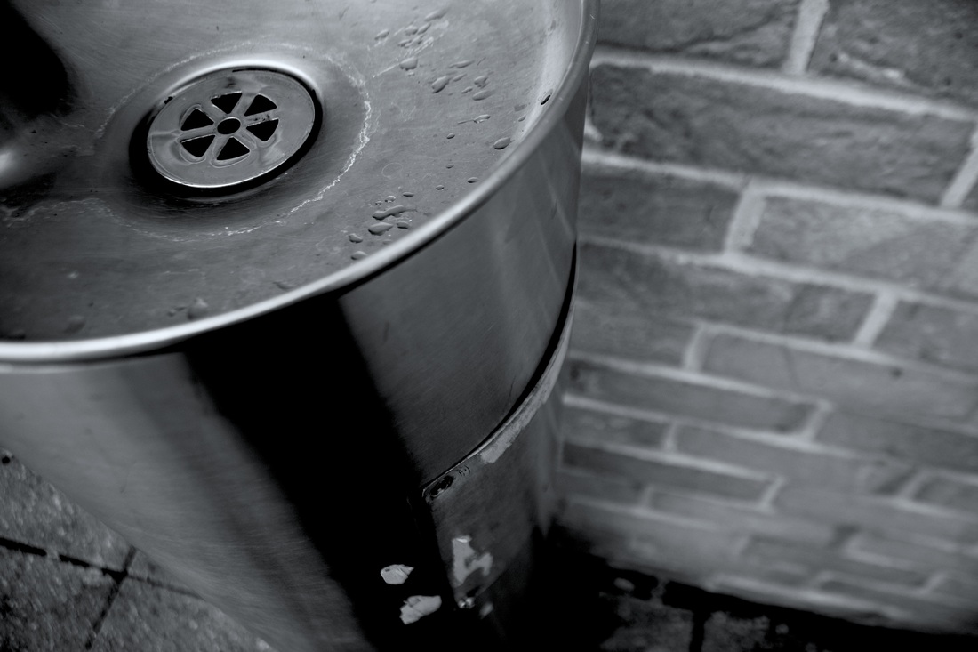
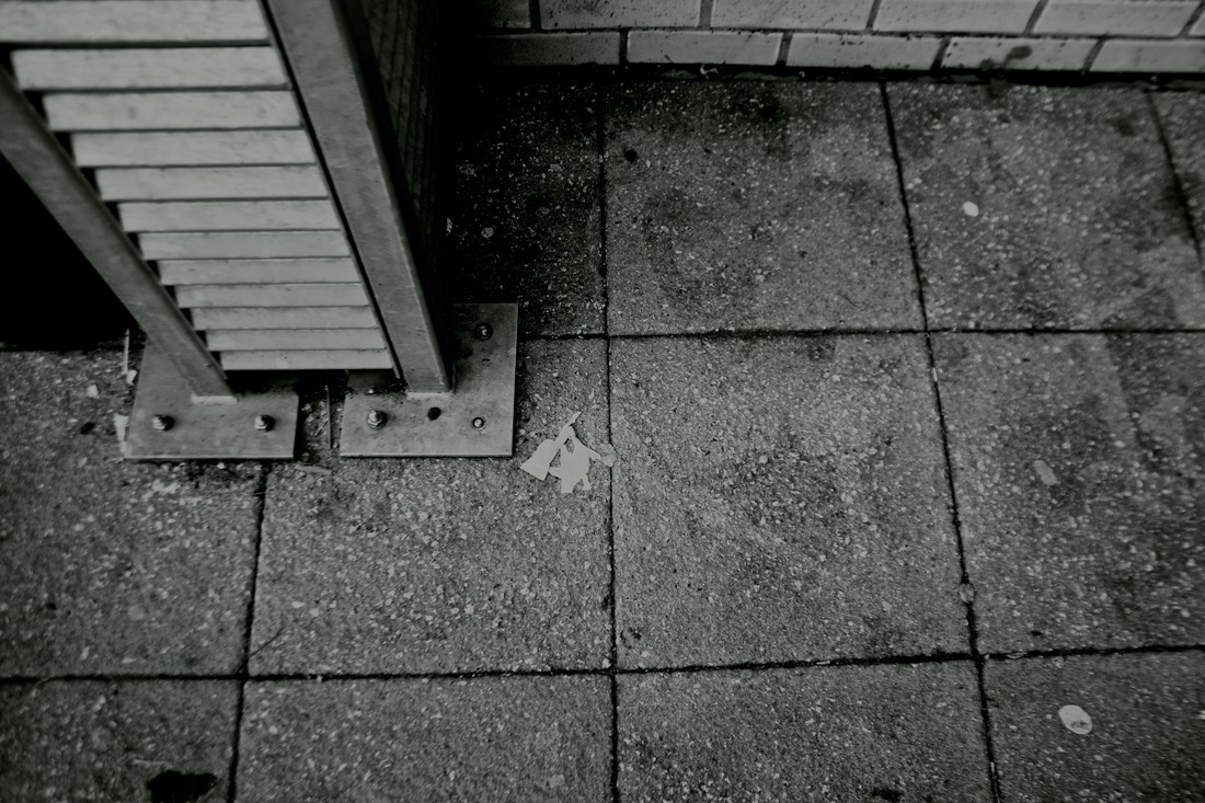
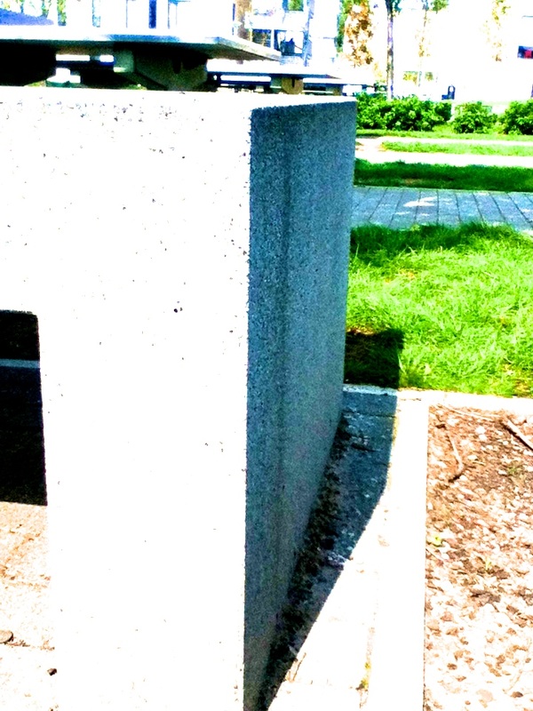
For my second set of photographs I continued with the B&W theme and took a selection of photos around the centre of the school, I focused on shadows, shapes and outlines. Above are 12 of my favourite images that I subtly edited on photoshop, usually to increase definition of the lines in the photographs. Overall I do not have a favourite image but I am equally pleased with all of them, I particularly like the rawness and tone in these style of photos and I think being B&W really helps to showcase the formal elements I have focussed on without the distraction of colour. Black and White brings out the different tones of each photograph extremely well to create some unusual and moody photographs. I feel black and white suits all of these images very well and that is the main thing I like about B&W photos; the fact that it is so versatile, it suits almost any type of photography.
Experiment #3
Experiment #3
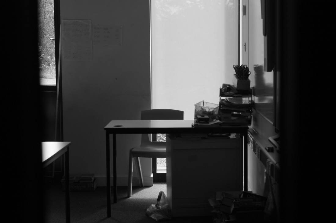
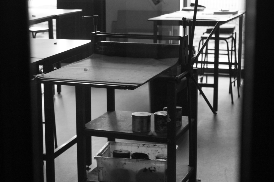
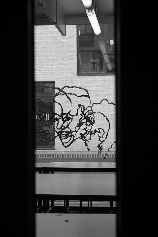
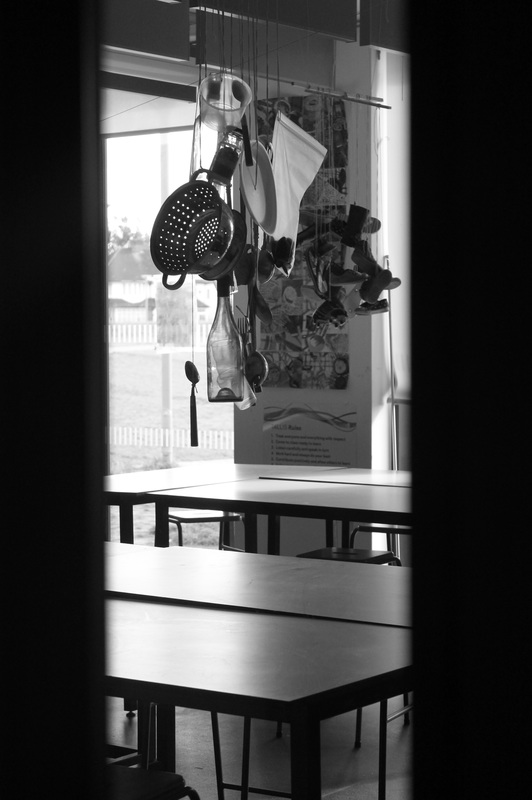
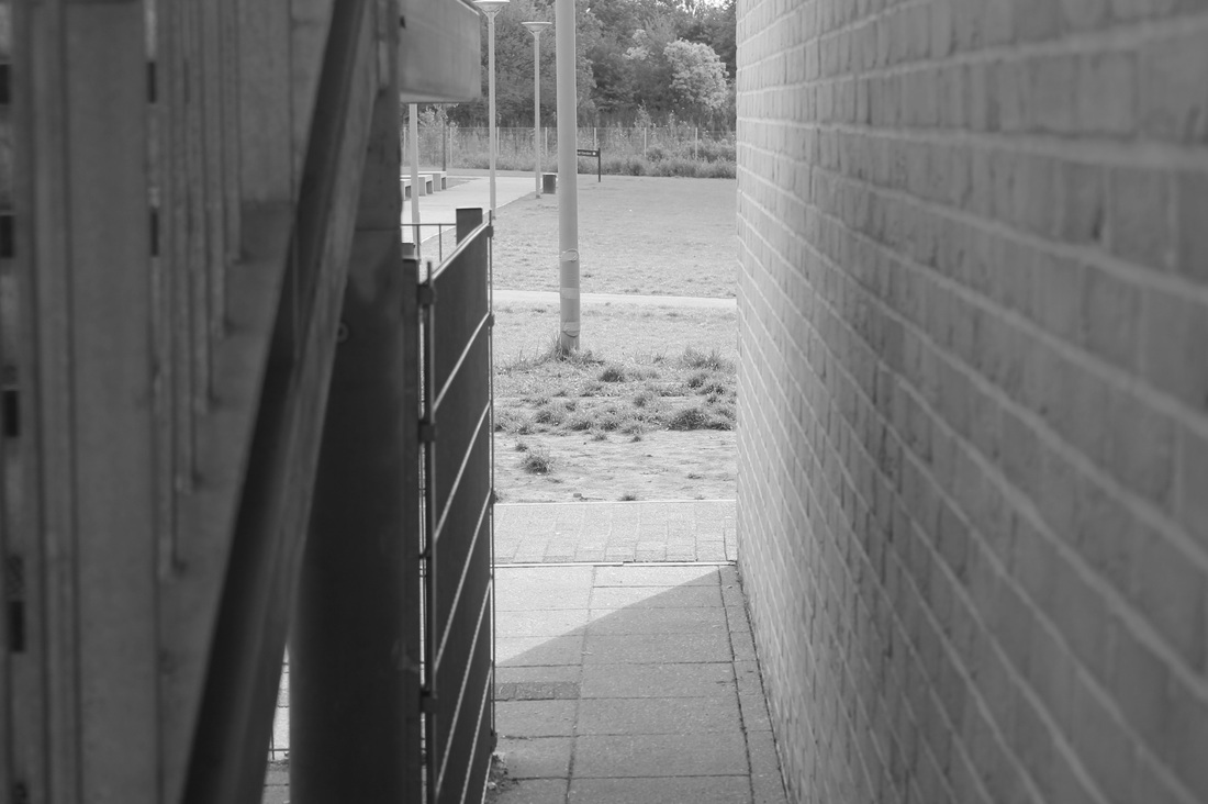
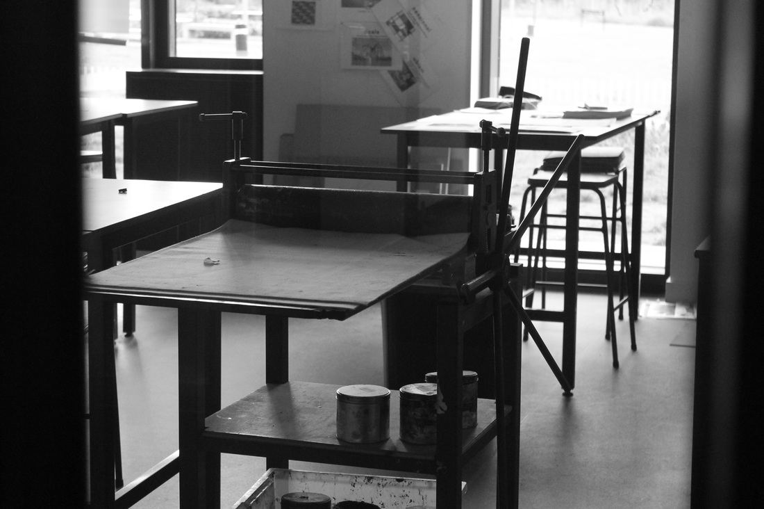
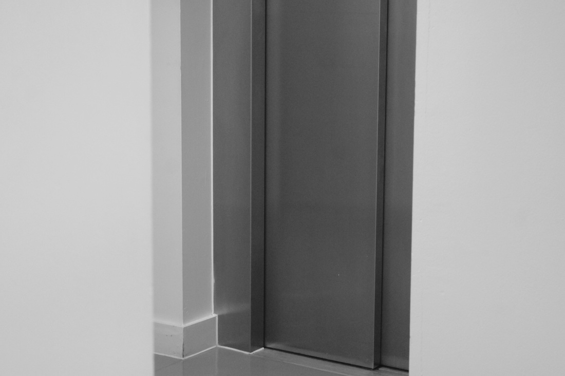
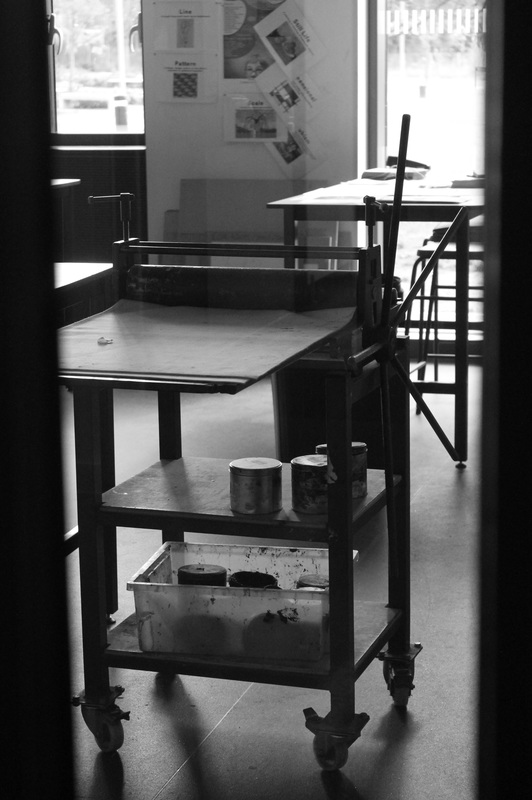
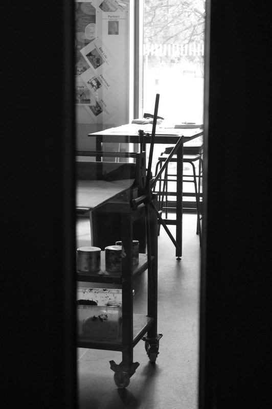
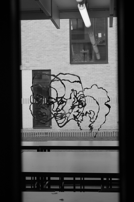
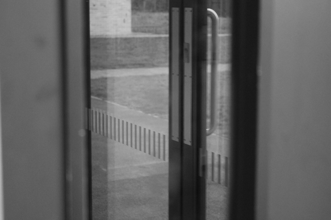
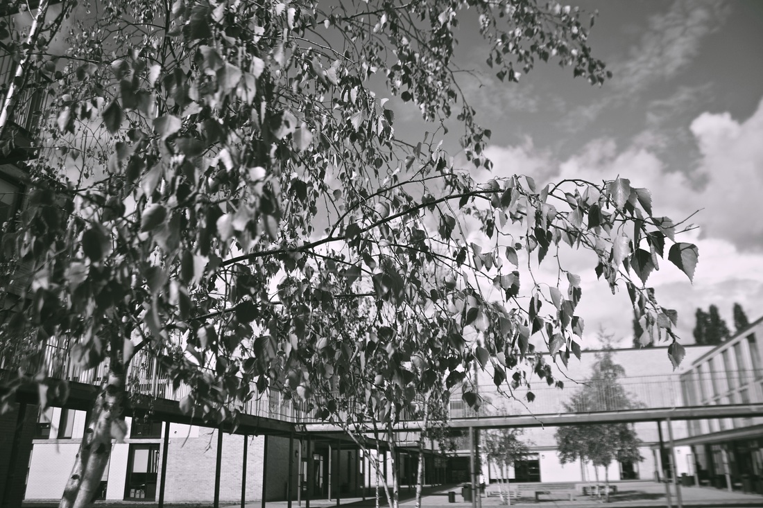
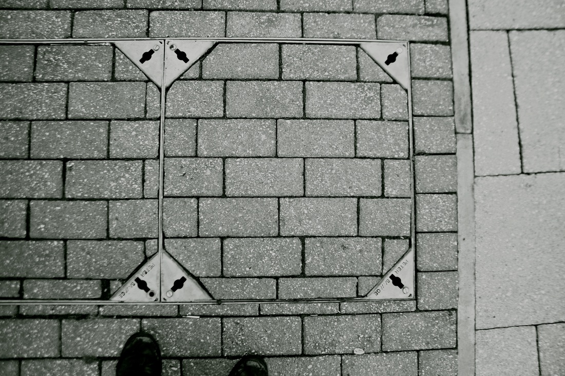
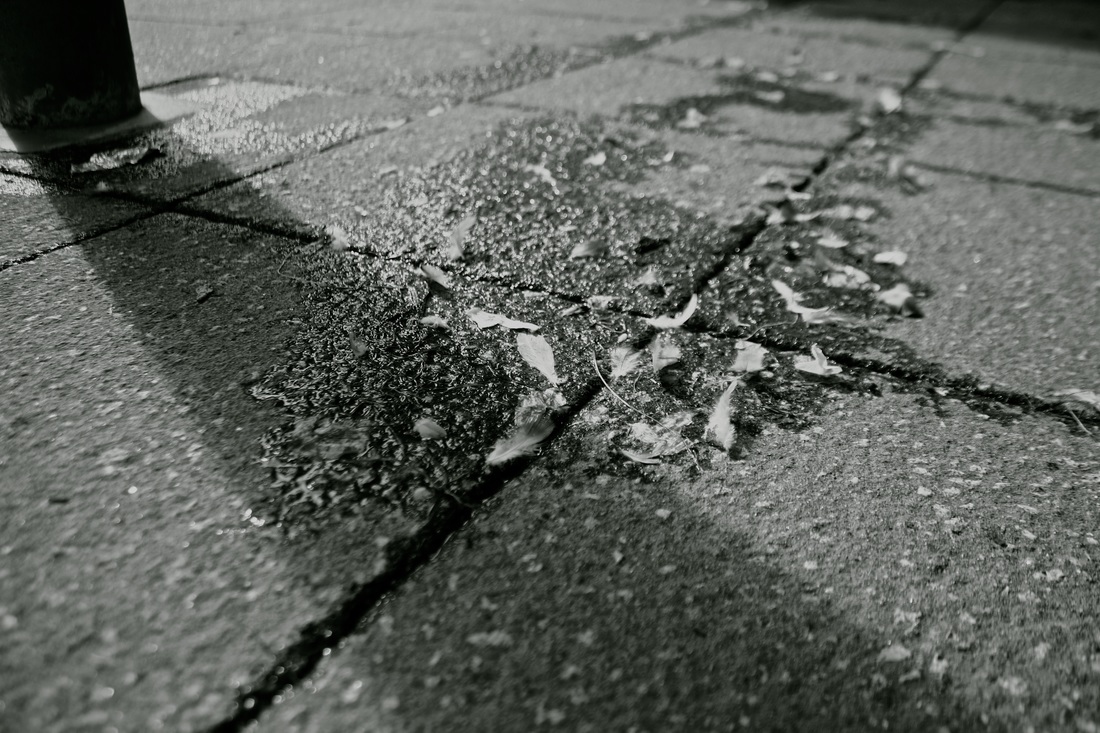
Above is my third set of photos. For this experiment I spent 10 minutes walking around block 1 peering through class room doors and and looking for lines. I focused on creating borders in each photograph, thats why I felt the best images were taken from the outside of classrooms looking in, using the edges of the door as the border. This simple technique framed the image very neatly creating a more interesting overall photo. Again B&W worked extremely well for these style of images, as I am focussing on lines it meant the shadows were more prominent and so the lines were displayed clearer.
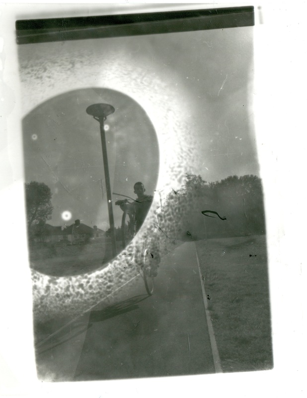
My own Negatives
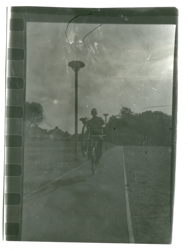
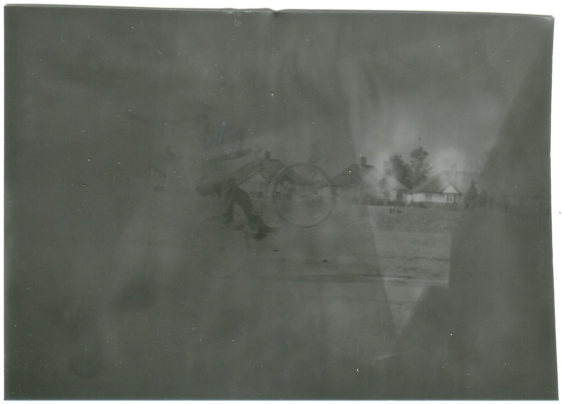
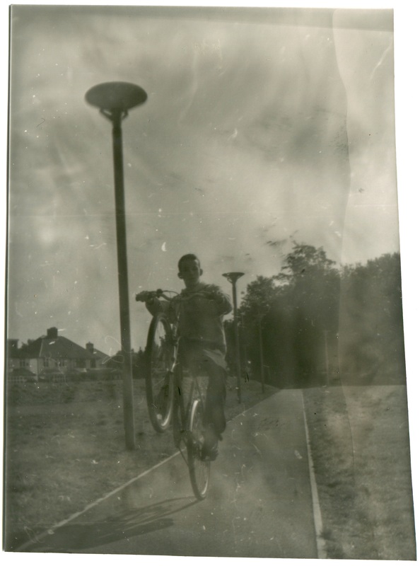
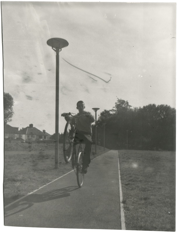
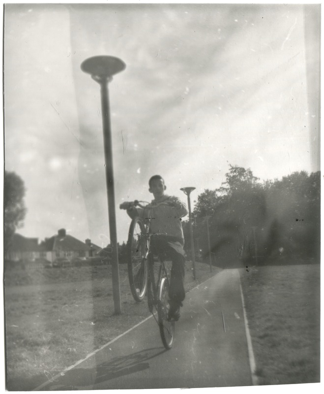
Here are a selection of 6 negatives I put on the enlarger in the dark room to create a photogram. I used a 2.8 F aperture for all the photograms and exposed every photo for 3.5 seconds. I left the first two photograms in the developer for too long which meant they came out too dark and
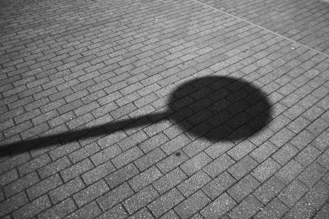
The fourth photogram came out the best, it is the clearest and cleanest of all the images. The tones of colour are exactly like the real photo and show the cloudy sky in the right light rather than the other photograms which came out with the sky darker than it really was. My favourite photogram was the fifth one which I placed under my home-made positive. This turned out surprisingly well and created quite a cool design over one half of the image. If I did these again I would definitely photograph more architectural objects such as the abstract street lamp, as I feel these show up really well in black and white and are quite clear even if the photogram is dark or blurred.
The fourth photogram came out the best, it is the clearest and cleanest of all the images. The tones of colour are exactly like the real photo and show the cloudy sky in the right light rather than the other photograms which came out with the sky darker than it really was. My favourite photogram was the fifth one which I placed under my home-made positive. This turned out surprisingly well and created quite a cool design over one half of the image. If I did these again I would definitely photograph more architectural objects such as the abstract street lamp, as I feel these show up really well in black and white and are quite clear even if the photogram is dark or blurred.
