|
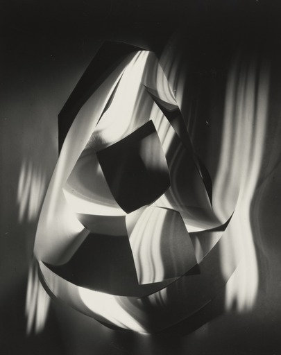
Francis Bruguière
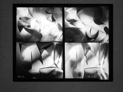
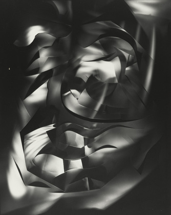
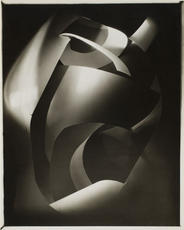
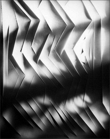
Francis Bruguière was born in 1879 in San Francisco. In 1928 he moved to London to experiment with abstract photography. Bruguière explored the boundaries of experimenting with light and how he could control and sculpt it. He first started doing this in photography but later moved onto cinema and in 1931 created a short, silent film called "Light Rhythms" on the right are some stills from this film. I really like his "Cut Paper Abstractions" series. Bruguière does a good job exploring and presenting the behaviour of light on paper. He shapes both to create interesting shadows and tone of light. |
|
|
Tamara Lorenz
Tamara Lorenz is a german artist and photographer born in 1976. Lorenz creates angular, block constructions and then uses bright colours and creative lighting arrangements to really emphasise the richness of the tones and contrast. I really like Lorenz's photography, I like the fact that her work is half graphics, half photography. She creates objects that blend reality with a style that looks false and almost computerised, unless you look carefully you will then see the work is actually made up of scraps of paper. 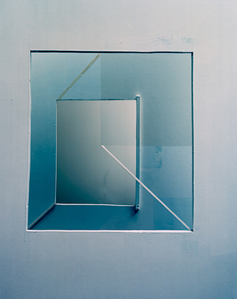
|
It was very hard to come up with a favourite piece of work by Lorenz as I like all of her work, and I think they work best together as a group. In the end I decided on this rather subtle piece by her. I liked this because at first it may look like a perfect arrangements of blue squares but when you look closer you realise its actually quite rough around the edges; paint dripping down the walls, roughly cut edges and patchy textures on the squares. I think this is what makes it though, it has a nice quality to it that contrasts the perfect edges of graphics and shapes with the rough edges of craftsmanship and building materials. The colour composition and arrangement and choice of shapes is also very subtle, she only uses blue colours that in places blend into white. The whole piece has a wave of blue colour coming over it. The blue is most intense in the bottom left corner of the image and then gradually fades out to white as it travels upwards. The stark white line on the bottom right of the image is also a nice touch, it breaks up the image and draws your focus to this area which then makes you analyse the whole design in more detail. |
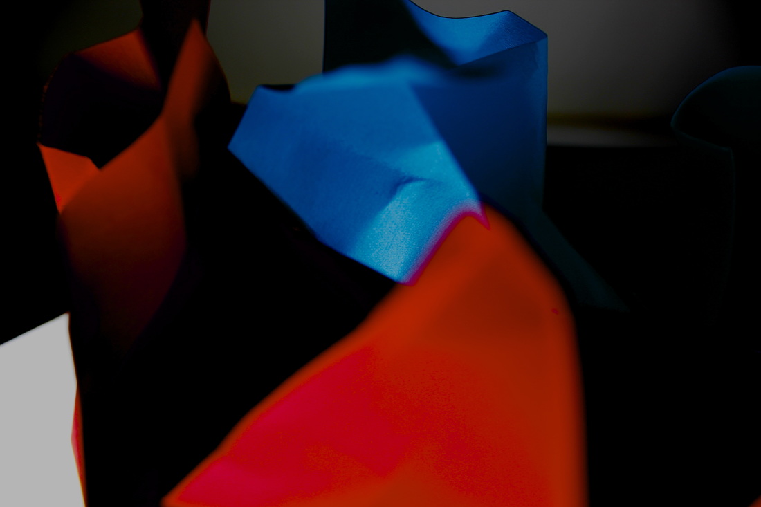
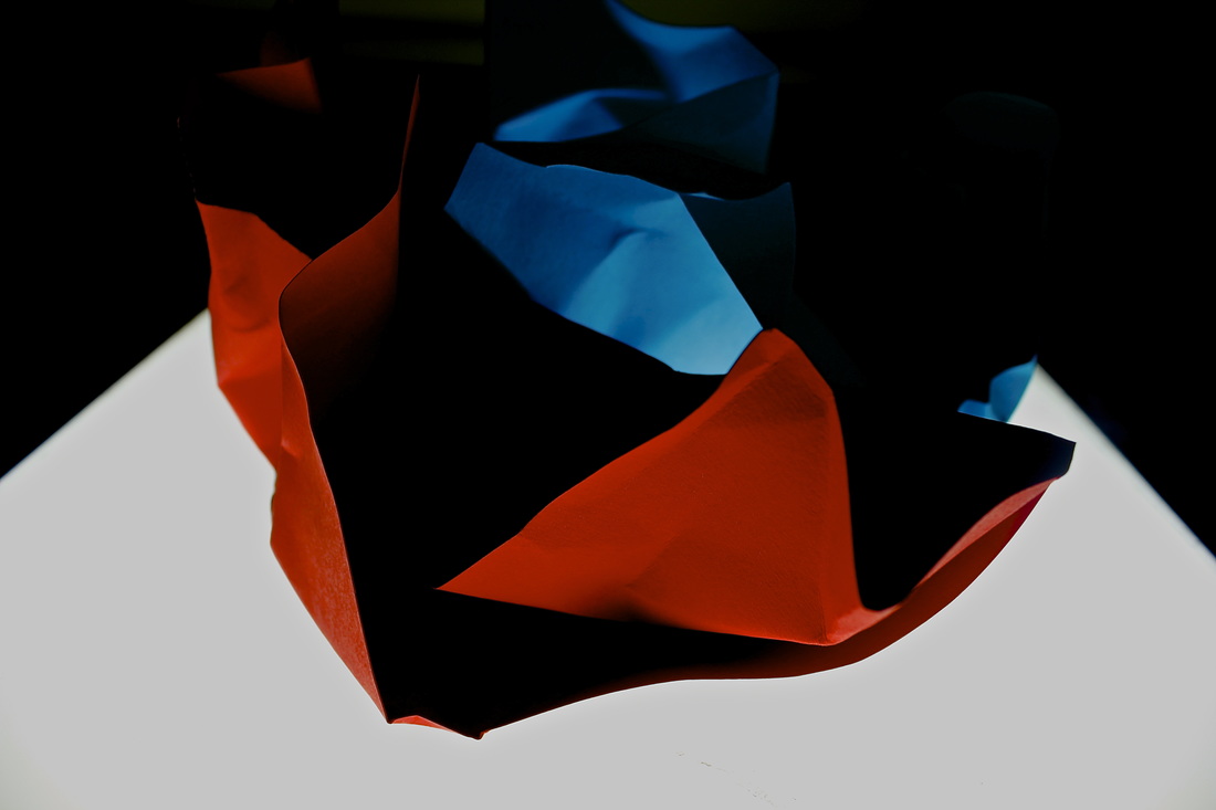
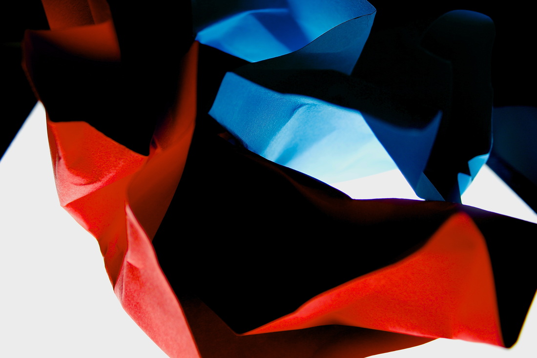
Experiment 1
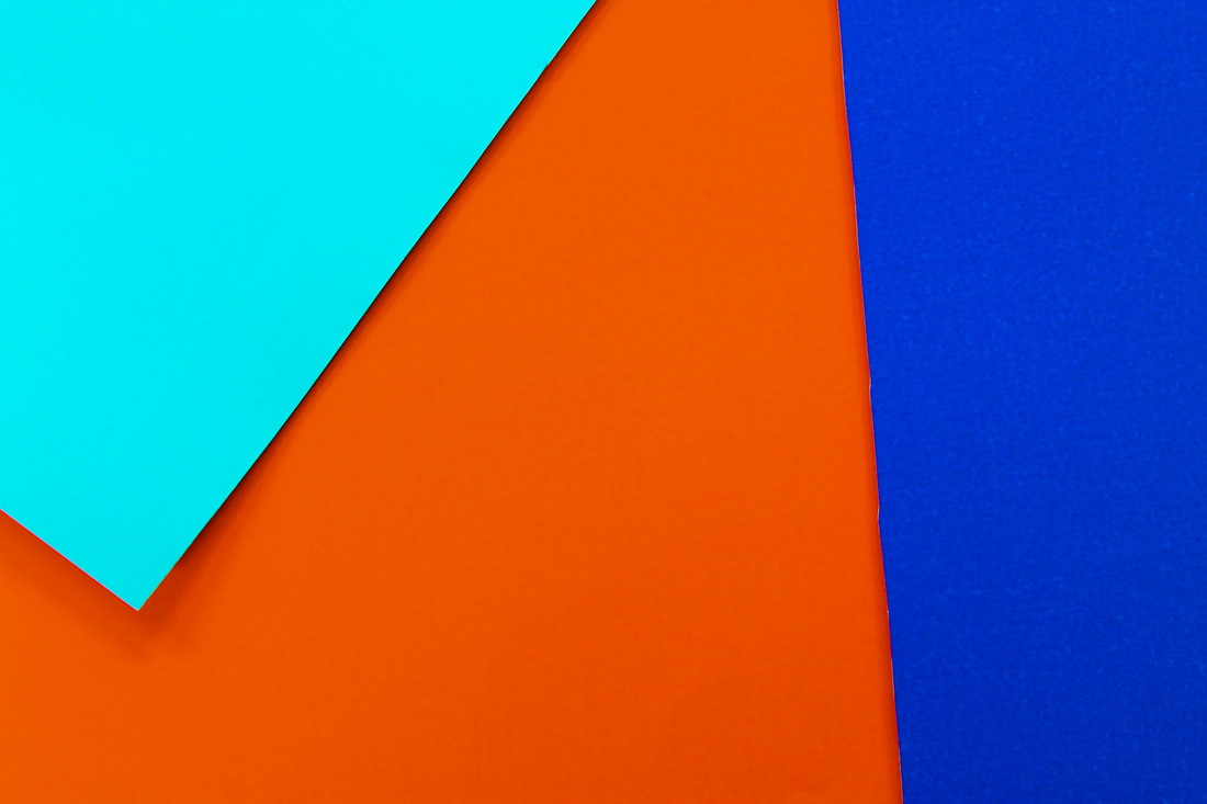
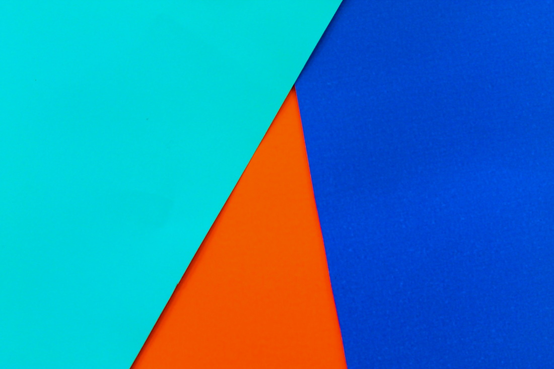
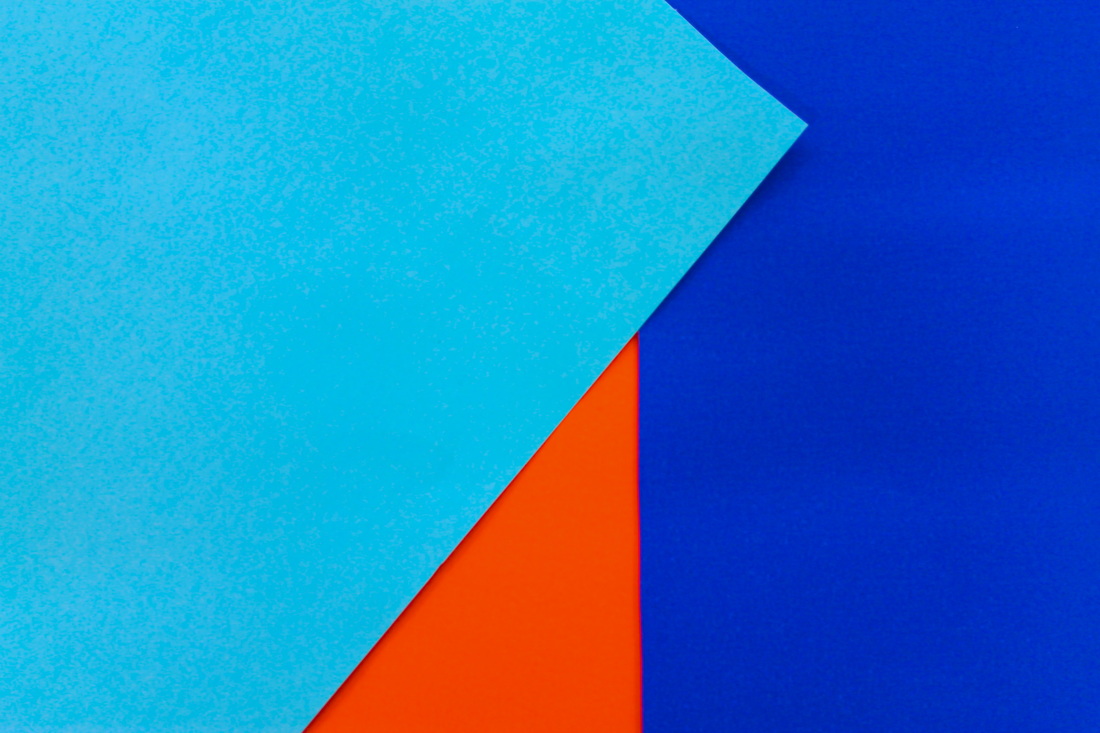
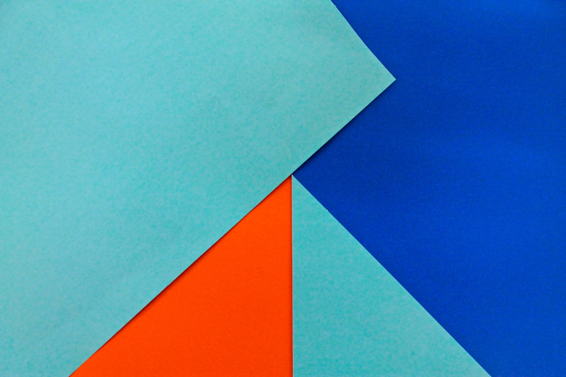
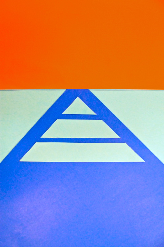
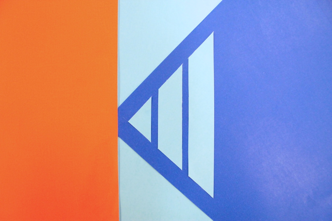
Here are the 8 best images from my first experiment. I first simply placed 3 uncut pieces of paper together in mixed arrangements of different angles. I then moved on keeping the same shape but cutting another piece of blue paper to make a symmetrical pyramid. I liked the idea of the pyramid, this reminded me of 1930s design especially the fact that only 3 colours have been used in the composition. Next I designed my own single colour pyramid made out of three sharp, angled blocks of paper, for this style of design I tried to recreate my own 1930s art deco, geometric arrangement. I ran out of time to experiment further with the design which meant the final composition looks only half finished, to finish off the design I might add a few more detailed features.
When I uploaded the images I wanted to loose the paper feel and instead make them appear more like blocks of colour. To do this I increased the saturation, contrast slightly and decreased the temperature, doing this increased the vibrancy and tone of the colours giving a more surreal, unnatural effect.
When I uploaded the images I wanted to loose the paper feel and instead make them appear more like blocks of colour. To do this I increased the saturation, contrast slightly and decreased the temperature, doing this increased the vibrancy and tone of the colours giving a more surreal, unnatural effect.

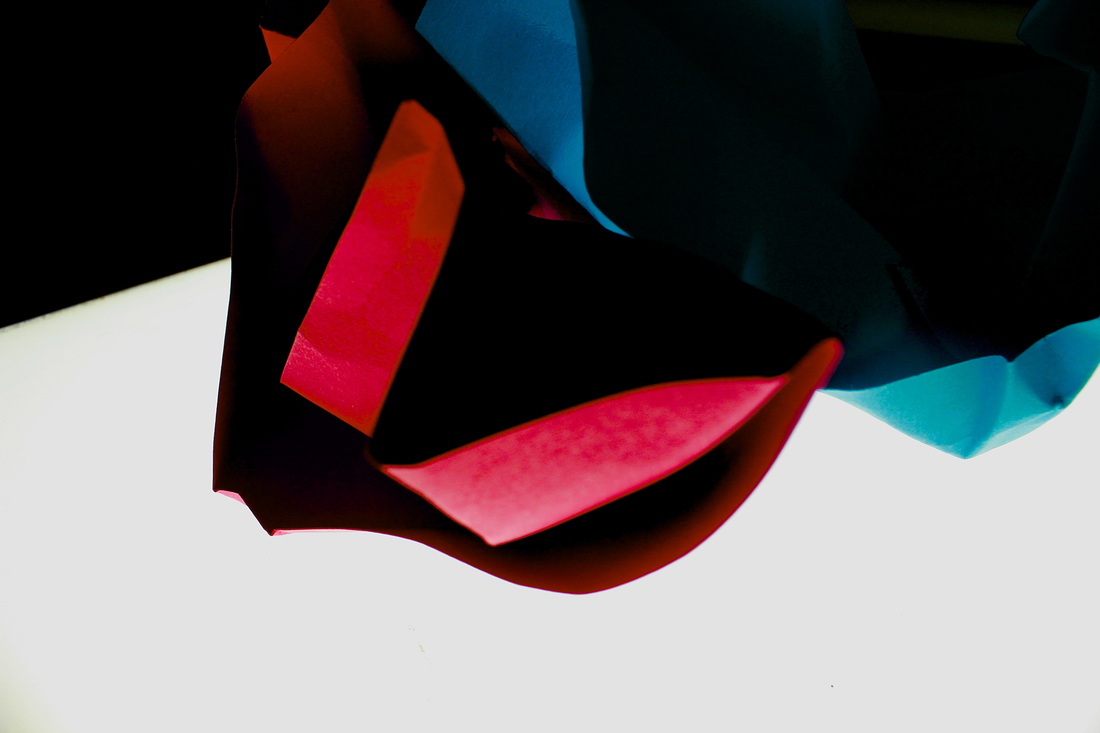
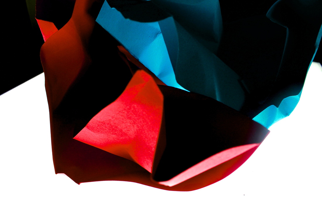
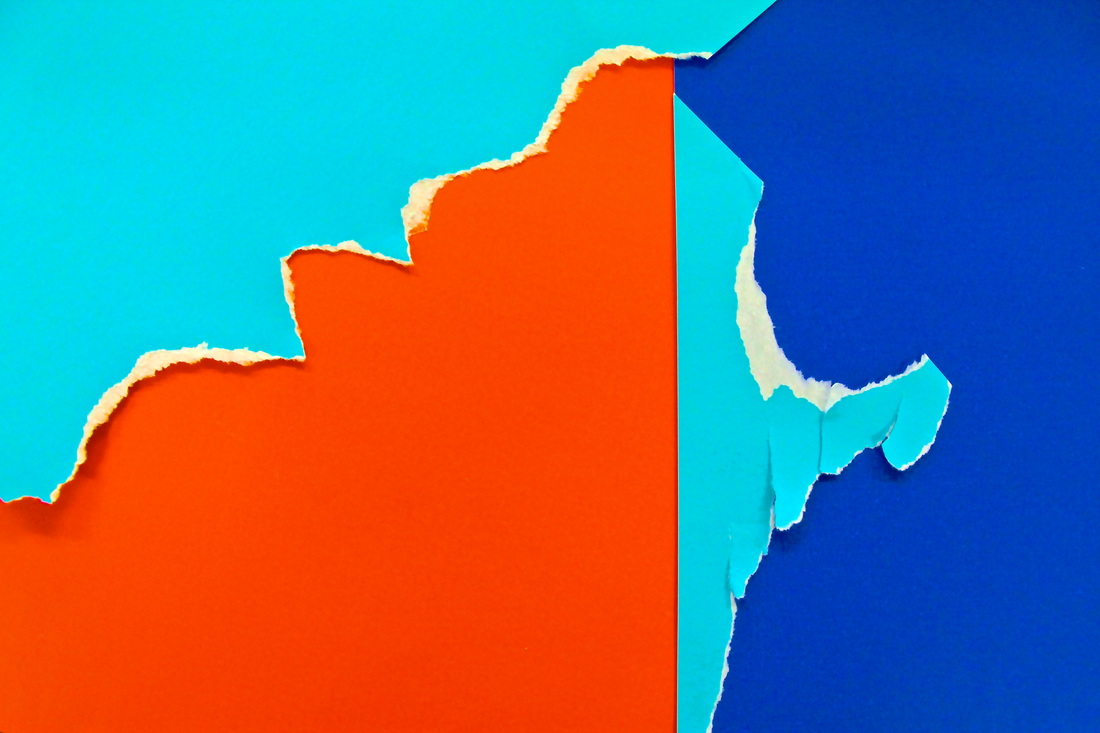
For my next experiment I took inspiration from her use of vivid colours against dark backgrounds.
