Photogram - A picture created without a camera but with photosensitive material
|
Man Ray
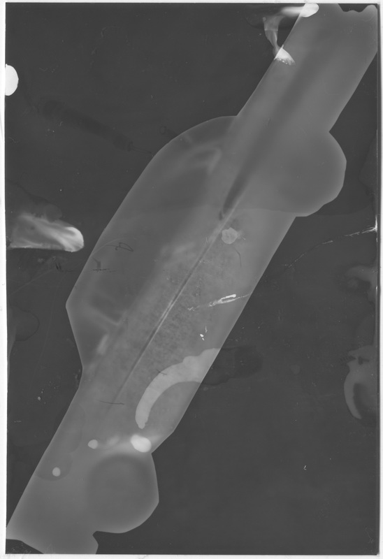
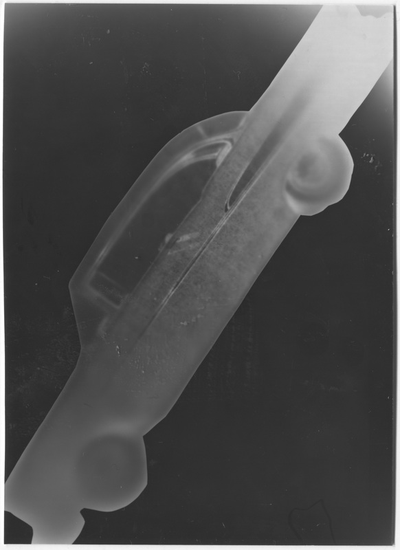
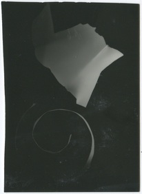
Man Ray created photograms during the 20th century, he called them "rayographs". He experimented with numerous factors affecting photograms such as the length of time an object is exposed for and by moving objects as the image is being exposed. Each of Man Ray's images are well composed with an even amount of negative and positive spaces. My favourite "rayograph" by him is the first one in the slideshow of an unravelled camera film. I like the translucent organic shapes of the curled up film, the fact that the film is see-through means as a result it creates a much more interesting image than solid objects do. The intense contrast between the negative black space and the white positive space creates a strong difference in tones making the white feel a lot more powerful and stand out better. Lines also play a big part in his "rayographs" since the background of the image is black all the white object's outlines clearly show up creating many different lines. |
László Moholy-Nagy Photograms were most popular in the early twenties among photographers such as Moholy-Nagy, he used two methods of production The first consisted of placing the objects directly on a special photographic paper and exposing the whole thing to natural or artificial light: after a time the contours and shadows of the object left light surfaces on a dark background on the support. The second took place in a dark-room -where the evolution of the forms is no longer visible in real time- and the result could only be observed after developing and fixing the test. I think all of Moholy-Nagy's photograms are quite interesting, they all have semi translucent images in them and unusual compositions. However I am not that impressed with his work overall, I do not feel that they inspire me and I do not think his photograms of a high standard, but they were taken in the 1920s so for that period of time they are not too bad. |
Taking a Photograph Without a Camera
I am looking directly up at the light, shadows are casted over the white ceiling. The two orange metal blocks centralise the light, the top third of the image is a shadowed part of the white ceiling tiles. Part of the blind is shown in the bottom half of the image and the light is peaking through a crack on the right, The overall light is quite dark and subdued, with the harsh shapes looking softer than they really are.
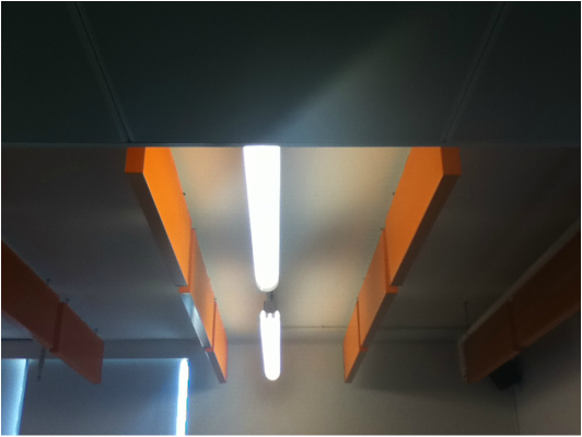
This is a photo taken by my classmate Aidan following my description. The photo is exactly how I imagined it, although the light fitting could have been positioned slightly more in the middle.
My Photograms
Experiment #1 - Classroom Items
These were my first 2 photograms I used a selection of objects from around the classroom. For each photogram I guessed how much time I should have exposed them for, this was inaccurate but they still turned out alright. However for my next photograms I might expose them for slightly longer to have a stronger contrast between the black and white colours. I also judged by eye how long I left the images in each of the chemicals, the developer for approximately 25 seconds, the stop for approximately 15 seconds and the fix for about 2 minutes.
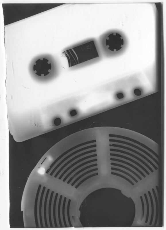
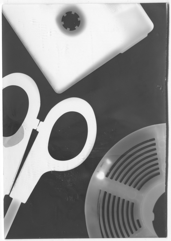
Experiment #2 - Personal Items
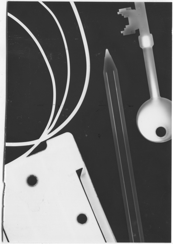
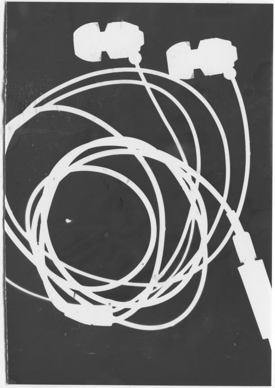
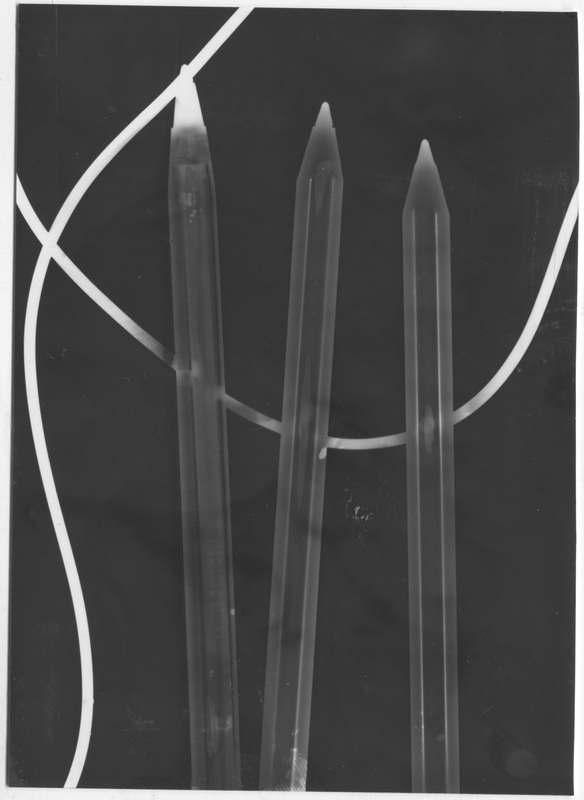
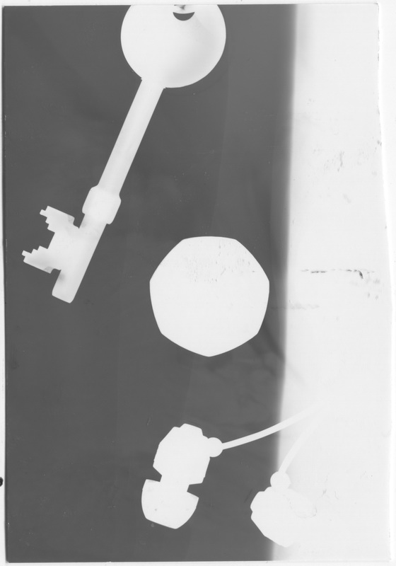
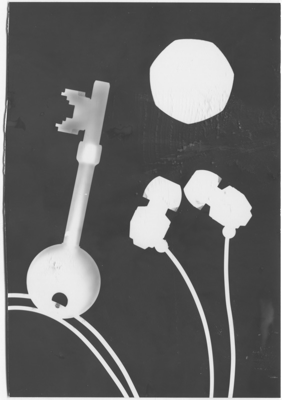
For my next set of photograms I used items just from my pockets. I think the Biro pens were the most successful item because they are semi-transparent, so created a cool effect and they are clearly recognisable as Biros. The headphones were also successful however I left the paper exposed for too long and in doing so they are over-exposed and all detail is lost. My favourite photogram is the first one, with the key, Biro, headphone cable and my student card holder. This photogram was exposed for just the right amount of time to show the transparency of the biro but also show the whiteness of the opaque objects against quite a dark black background. For this photogram I exposed it for 1.8 seconds, then I placed it in the developer for approximately 20-25 secs, the stop for approximately 20 secs and the fix for approximately a minute. If I were to do these again I would process them all for a similar time to this one, the bottom left photo turned out half white because I removed it from the enlarger while the light was still on.
Experiment #3 - Items in my bag
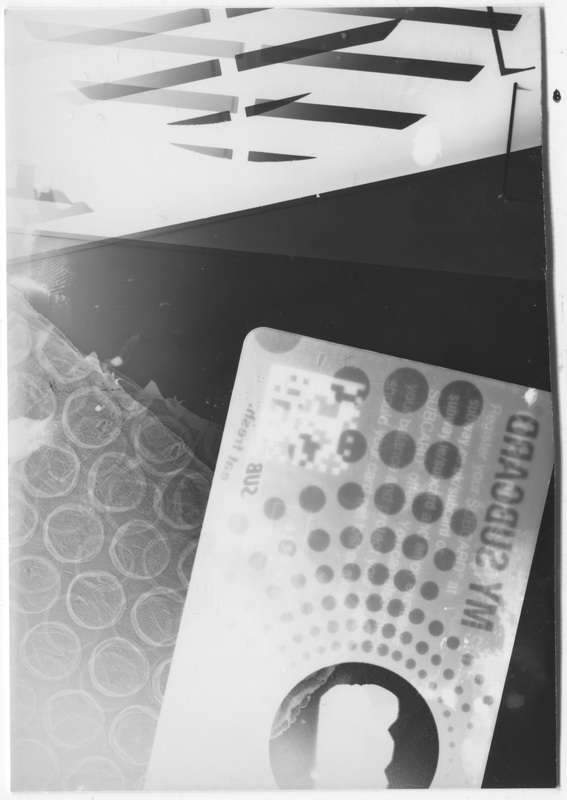
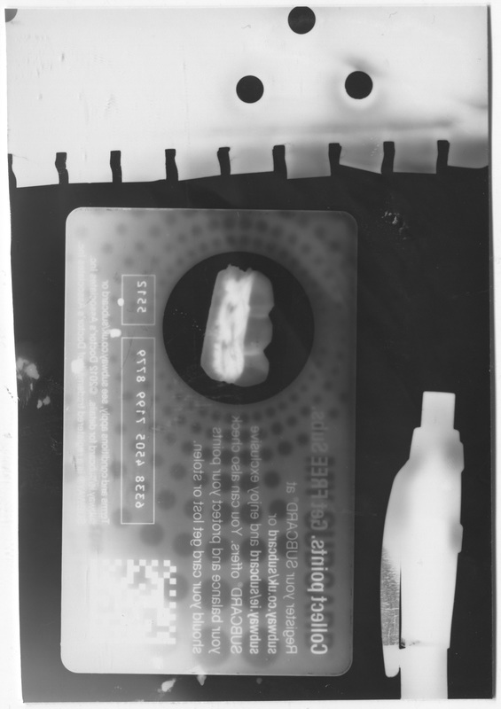
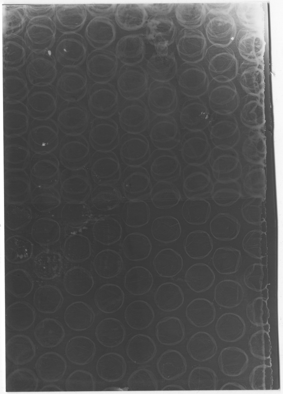
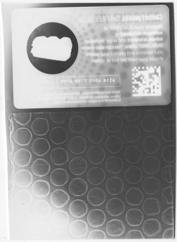
For this experiment I used some items I found inside my desk at home, a semi-transparent Subway card, a pen, some bubble wrap, some parts of a computer fan and a picture of a 1957 Chevrolet Bel-Air. My favourite photogram is the first one, I like the composition of the Subway card overlapping the bubble wrap and the broken bits of the computer fan taking over the top of the image. The pattern on the Subway card with the reversed writing help to create a really cool finished image. I also feel that I exposed and processed it for almost exactly the right amount of time, for this photogram I used the exact same times as my best one from the second experiment. I am quite disappointed with how the photogram of the car came out, The extravagant 50s styling and shape of the car can be seen but the details cannot be seen. If I was to do this photogram again I would expose it for possibly double that amount of time.
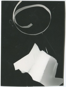
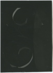
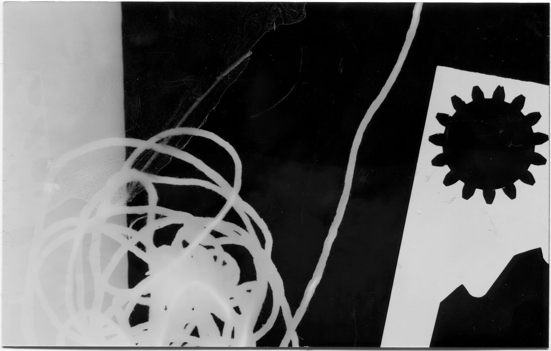
Experiment 4 - Paper Curls
F. 8, 4.5 Secs
|
F. 2.8, 2 Secs
|
F. 4, 4 Secs
|
This was my fourth experiment, I used just two pieces of white paper. One piece I bent around a pencil and the other I scrunched up. This created some interesting effects showing the way light is reflected off the bright white paper. I like all 3 of these photograms very much because the colours are quite subtle and the tones of the images are understated creating 3 photograms that look interesting in a group together. The photogram on the far left came out slightly over-exposed meaning some of the detail was lost. `however this over-exposed photogram stands out from the other two making the series look more striking.
Experiment 5 - Ski Photo Positives
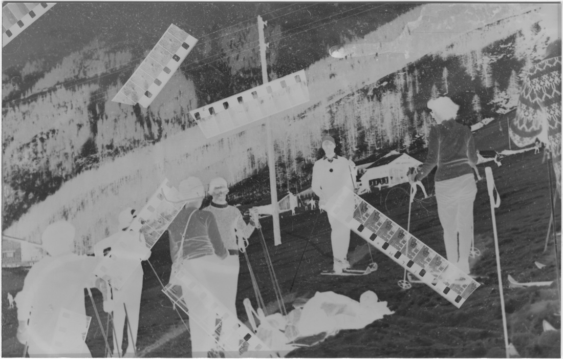
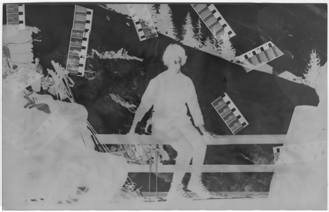
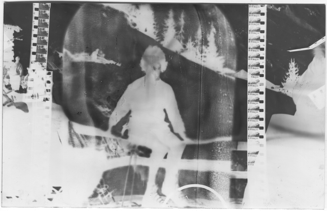
Here are a selection of photograms all made at F.5.6. The top left photogram was exposed for 4.5 seconds which created an over exposed photogram, that is why there is a really big contrast between the black and white colour, because of this the detail is also lost. For the other three photograms I used a 1960s positive of skiers at a resort, These surprisingly turned out really well, the top right photo is definitely my favourite, it is not under exposed or over exposed and looks really interesting with the shards of 8mm film scattered over the surface of the image. To print this image onto the photogram I used a positive in a slide which I then inserted into the enlarger and projected onto the photographic paper. For the bottom right photo I experimented with placing a glass bottle over the projection of the person sitting on a fence, when I developed the photogram the reflections and outlines of the glass showed up quite clearly and this also made the outline of the person blurred. My overall favourite is definitely the top right photogram, this has a really nice tone of both dark black and light white, this combined with the composition of positives scattered on top creates a really good looking overall photo.
Chemigrams
|
Pierre Cordier
Belgian photographer, Pierre Cordier was a pioneer of the chemigram. Cordier stumbled across chemigrams by accident when he wrote out a dedication to a young German girl with nail polish on light sensitive paper. When Cordier first invented Chemigrams. they were not accepted by painters or photographers, the same as photograms in the twenties never received much public acceptance. Since the early 1980s chemigrams have become better well known and are studied by art schools. 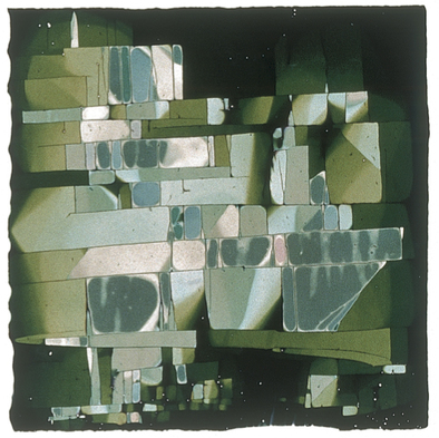
|
On The left is my favourite chemigram by Pierre Cordier, I love the mixture of different colours and shades of green, it reminds me of bits of glass washed up by the sea. I also like the presentation of the chemigram, the fact that it is a square reminds me of a small stained glass window, I think the image has quite a seaside feel to it probably because the different greens are quite similar to the colour of the sea. The rough, jagged border also adds to the overall feel and presentation of the chemigram giving the effect it could be ripped or broken. The mixed, geometric arrangement of squares and rectangles separated by thin black lines makes the image look really interesting, they are like building blocks stacked up on each other, the mixture of sizes also helps to create a greater contrast which is what makes this image so good. I would label this particular chemigram as a pattern because of the repeated shapes all next to each other, this is also the main and only focus in the image. |
My Chemigrams
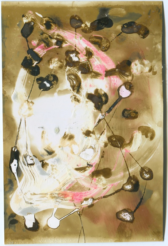
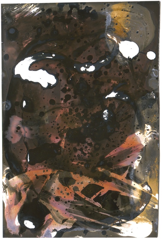
Here are a selection of my first five chemigrams. I am extremely pleased with them and somewhat surprised with how good they came out. I think as a set they look really interesting because of the large contrast between all of them, each chemigram is so different from each other, the tones, pattern and shapes are all very varied.
For the top left photogram I used a mixture of window cleaner and deodorant (the white colour), oil (the black colour) and ink (the red colour). I then put it in the developer for approximately 25 seconds, the stop for about 20 seconds and the fix for about 40 seconds.
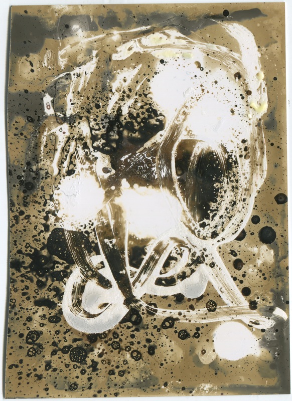
For the second photogram I used all of the chemicals available, deodorant, window cleaner (the white colour), ink (ink the red colour), and a mixture of two oils (the navy colours). For this chemigram I decided to place it in the developer for about 35 seconds and then just the stop for about 15 seconds.
For the third photogram I used droplets of window cleaner (white colour), and then dripped a cotton bud in oil (black colour) and dragged this around the droplets. Next I placed it in the developer for 25 seconds, the stop for about 20 seconds and the fix for 35 seconds.
For the fourth photogram I used a cotton bud dipped in soap and red ink. Then I placed it in the developer for about 15 seconds and then only the stop for about 10 seconds. I then left them to dry without putting them in the fix, the colours slowly changed, and I ended up with some really interesting colours.
For my last chemigram I used just bleach (white colour), deodorant (black colour) and oil (the navy colour). I then placed it in the developer, stop and fixe all for 20 seconds each.
For the top left photogram I used a mixture of window cleaner and deodorant (the white colour), oil (the black colour) and ink (the red colour). I then put it in the developer for approximately 25 seconds, the stop for about 20 seconds and the fix for about 40 seconds.
For the second photogram I used all of the chemicals available, deodorant, window cleaner (the white colour), ink (ink the red colour), and a mixture of two oils (the navy colours). For this chemigram I decided to place it in the developer for about 35 seconds and then just the stop for about 15 seconds.
For the third photogram I used droplets of window cleaner (white colour), and then dripped a cotton bud in oil (black colour) and dragged this around the droplets. Next I placed it in the developer for 25 seconds, the stop for about 20 seconds and the fix for 35 seconds.
For the fourth photogram I used a cotton bud dipped in soap and red ink. Then I placed it in the developer for about 15 seconds and then only the stop for about 10 seconds. I then left them to dry without putting them in the fix, the colours slowly changed, and I ended up with some really interesting colours.
For my last chemigram I used just bleach (white colour), deodorant (black colour) and oil (the navy colour). I then placed it in the developer, stop and fixe all for 20 seconds each.
My Slides
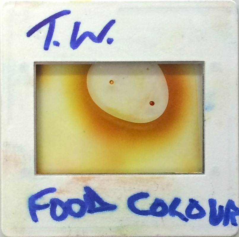
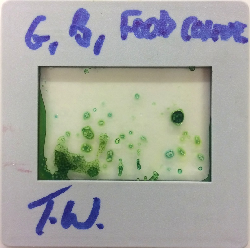
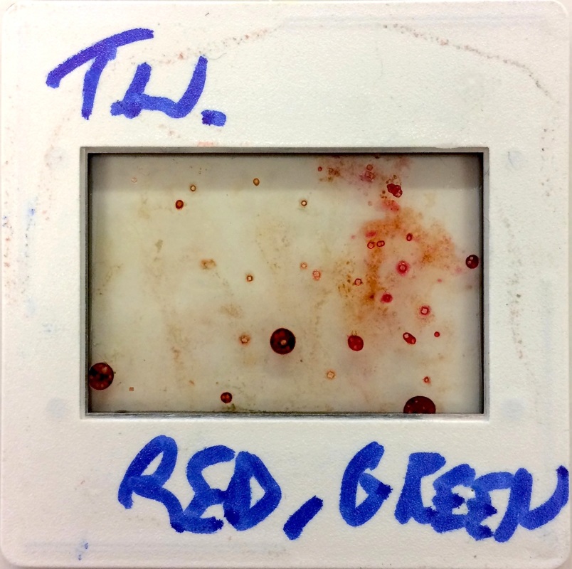
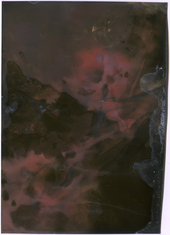
For my next experiment I created my own positive slides with chemicals in between two pieces of acetate paper fixed together in a slide. I used food dye on all my slides and the second and third slide I added salt to, this gave a rough, grainy effect. My favourite slide is the first on I made using just yellow food colouring blobbed in the centre, when the colouring was compressed between the two pieces of acetate paper it dispersed and slowly radiated outwards creating a cool sunlight effect.
Experiment 6 - My Chemical Positives
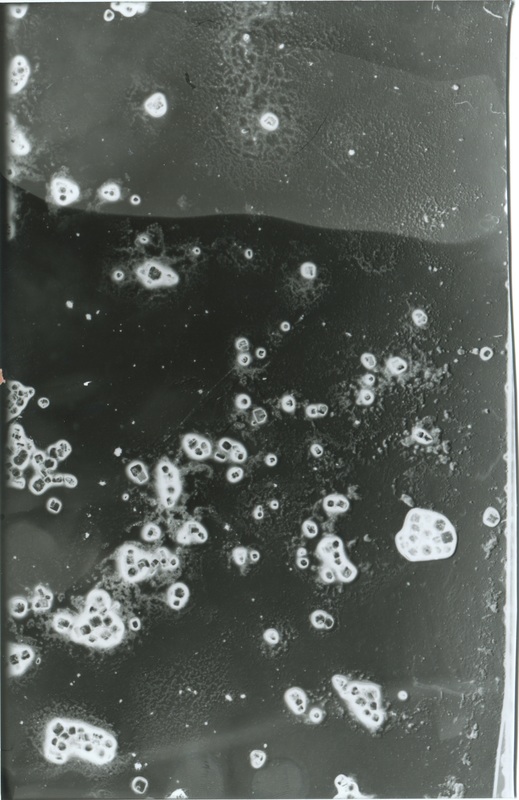
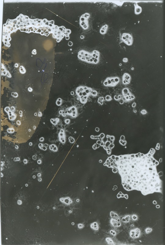
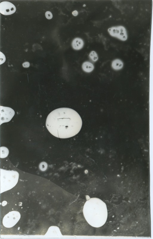
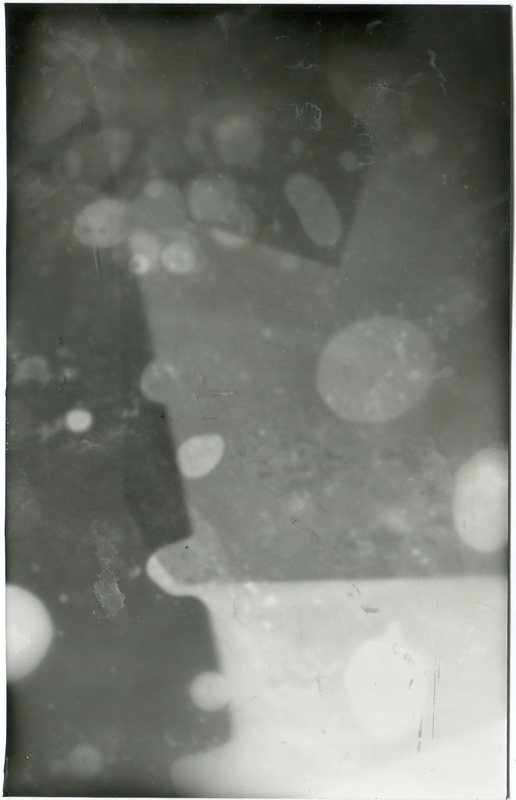
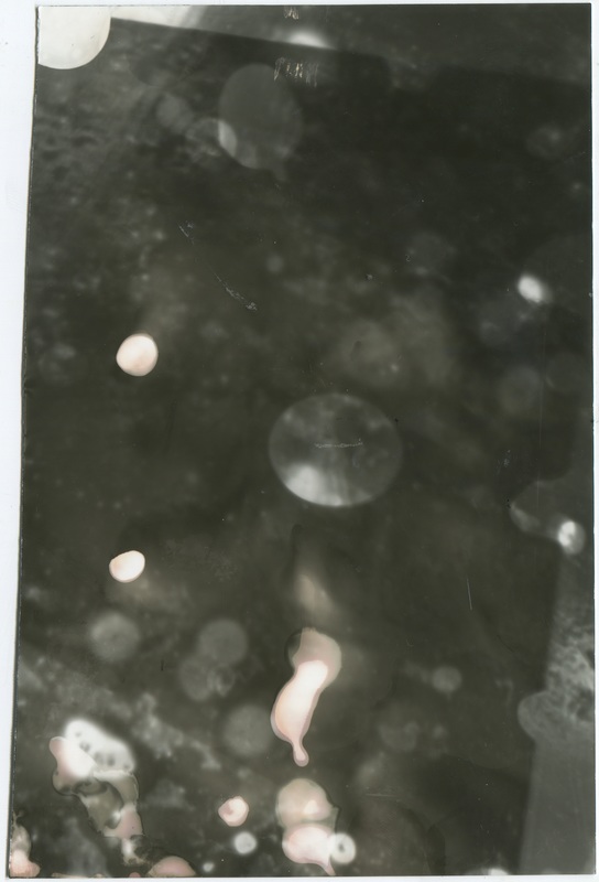
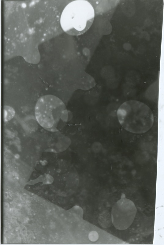
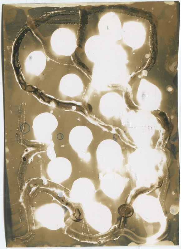
For this experiment I created photograms with my positive slides and placed them inside the enlarger in the dark room. All of these were created with a 5.6 aperture. The first and second photograms are my favourite, both of these were exposed for 3 seconds each. I like these two because they remind me of bacteria viewed under a microscope, the grains of salt are all in focus, the tones are also good, the dark colours are not too dark and the white colours are not too bright or overexposed. The third and fourth photograms were exposed for approximately 3.5 seconds, I really like the fourth image as it reminds me of smoke in a dark black sky, I knocked this piece of photographic paper with my hand which you may be able to see as there is an off-set black rectangle and also a bright white shape on the left side. I think both of these features actually add to the design of the photogram and make it more interesting to look at. The bottom four photograms were all exposed for approximately 2.5 seconds. With each of these photograms I moved the paper about numerous times to create blurred effects and a mixture of tones. I think all four of these photograms feel quite sub-dued and have an effect that makes them appear almost if they were taken under water. as they all have blurred 'bubble' like circles all over them. As a group I think all the images look really interesting as there is such a wide mixture in contrasts and patterns. The fact they are all so different is what makes them look so fascinating.
Eileen Quinlan
|
|
Eileen Quinlan is an american still-life photographer who shoots with medium and large format cameras.
She creates amazing geometric images full of angular shapes with beautiful dynamic contrasts and bright colouring. She experiments with shining artificial light onto glass and mirrors to reflect the intense colours. Her use of different materials and composition means her work results in a mass of colour and shapes that are almost like a kaleidoscope. Quinlan shoots only in film and tries her best to avoid using Photoshop and instead create all her effects naturally. I really like Eileen Quinlan's work. I think the colours are beautiful and the compositions are really well thought out and neatly put together. The first photo in the slideshow is my favourite piece of work by her, I really like the choice of colours in this image; dark green, streaks of teal, lime green, golden yellow, hints of orange and black. |
